BARDO
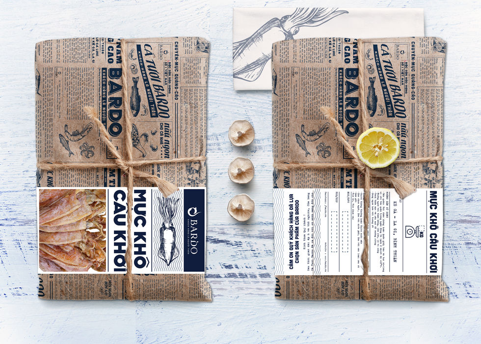
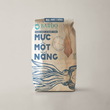
Bardo, a Ho Chi Minh City-based fresh seafood shop, is seeking a premium look for their packaging during the upcoming Tet holiday, featuring their special dried squid products. Bardo desires to pay homage to Vietnamese fishermen and reflect a traditional Vietnamese style in their packaging.
To achieve this, we developed the "Old Viet Nam" aesthetic, utilizing vintage fonts and colors. We incorporated a unique feature of Vietnamese culture by using kraft paper with a design resembling slim morning newspapers that were traditionally used to wrap fresh food.
The packaging contains informative articles about the Bardo brand and its products, including their values, the story of Vietnamese fishermen, product details, origin information, cooking instructions, and tips and tricks for preparing their specialties. These articles serve to reinforce the Bardo brand and highlight the unique qualities of their products.
Service
Art Director, Packaging,
Graphic Design
Client
Bardo
Year
2018


