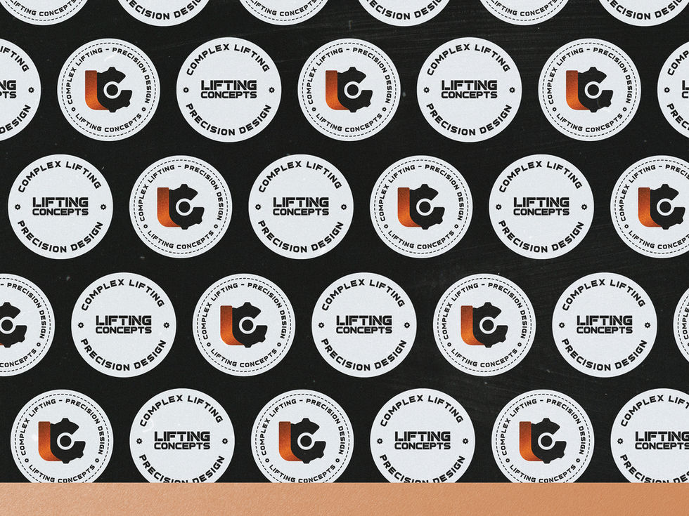
THE LIFTING CONCEPTS
Rebranding project for Mr. Hawkings, a consultant providing unique services due to his multi-national experience in the Crane & Heavy Transport Industries. His passion lies in cranes and the logistics surrounding them. He has been working diligently, managing several companies and helping them achieve success. Now, as he embarks on his own venture under the brand "Lifting Concepts", he wants to promote his company. And enhancing his brand recognition is the first step he has aimed for, starting with his existing logo.
The new logo should incorporate the initials of "Lifting Concepts," which are 'L' and 'C', along with the inclusion of a cog, symbolising the industry and cranes. The chosen slogan is "Complex Lifting - Precision Design." Mr. Hawkings has a strong preference for the colours copper, black, and orange.
I presented two logo concepts for his consideration, each of which contrasts in style, as per his request: an iconic and an illustrative style. He went with the iconic design, masculine yet elegant with a modern touch.
Service
Logo Suite (Primary/ Secondary/ Brandmark/ Wordmark/ Horizontal / 2 Other Variations)
One-page brand Style Sheet
Logo Variations Usage Guidance
Brand Collaterals (Business Card, Letterhead, Signature, Sign Writing, Clothing)
• Brand Elements
Client
Mr. Hawkings
Year
2023


